Alex 👾 does 🏗️ Data 🎛️

- Data Viz 13
- Tableau 8
- ETL 4
- Python 4
- Illustrator 3
- GIS 2
- Graphic Design 2
- Mapping 2
- SQL 2
- D3.js 1
- Machine Learning 1
- NLP 1
- Power BI 1
©2025 Alexander Reese
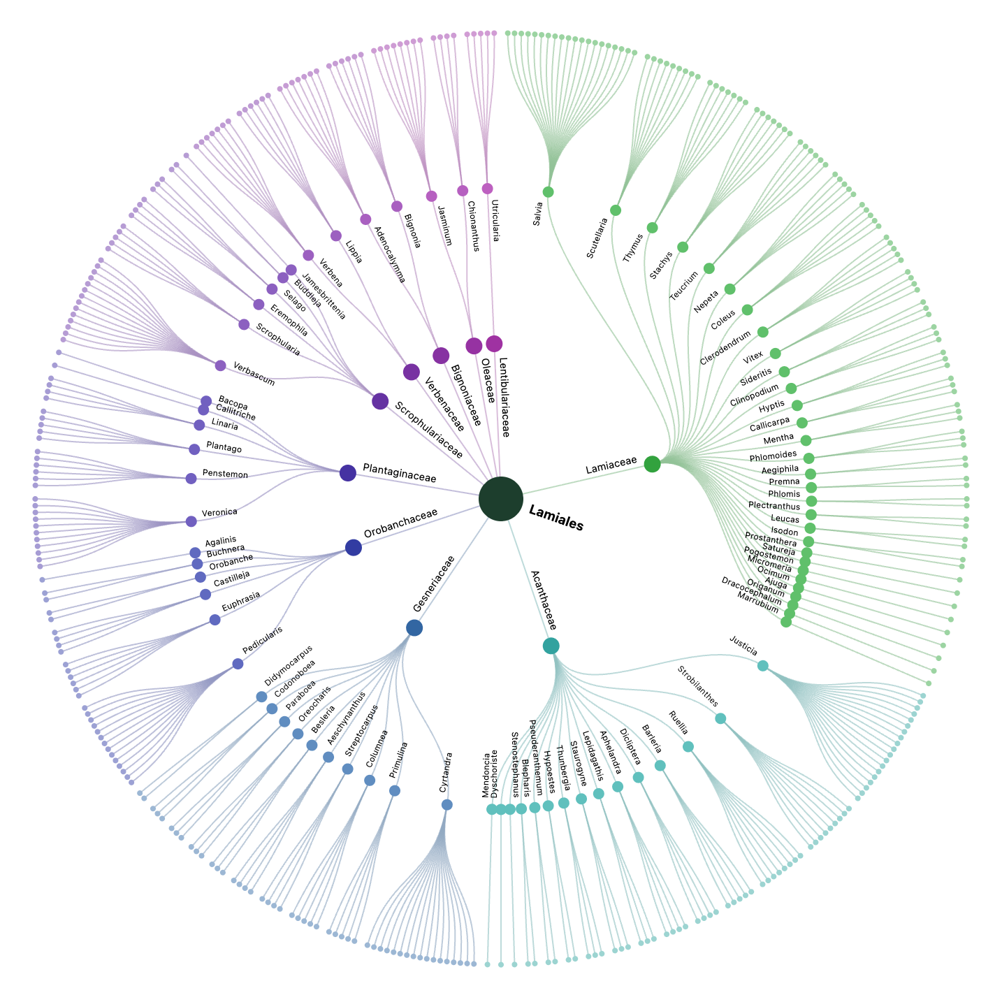
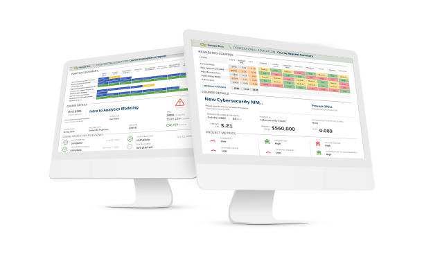
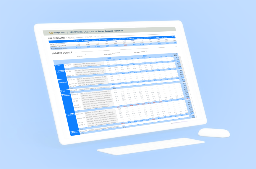
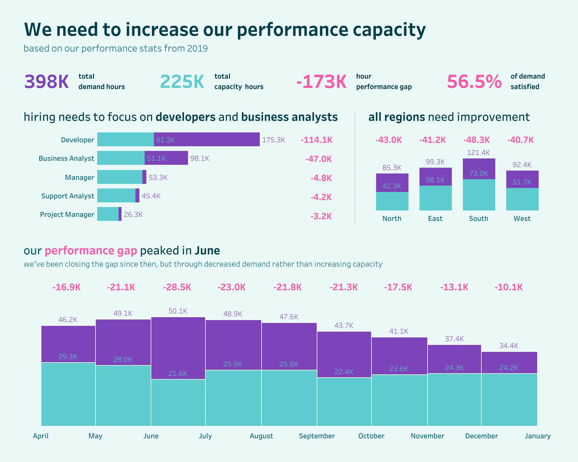
Human Resource & Project Management Tracker in Tableau
Developed a human resource allocation dashboard for Georgia Tech Professional Education to optimize staffing across course development projects. Integrated data from project management systems via Python API calls and built complex Tableau calculations to track resource utilization, capacity planning, and project timelines.
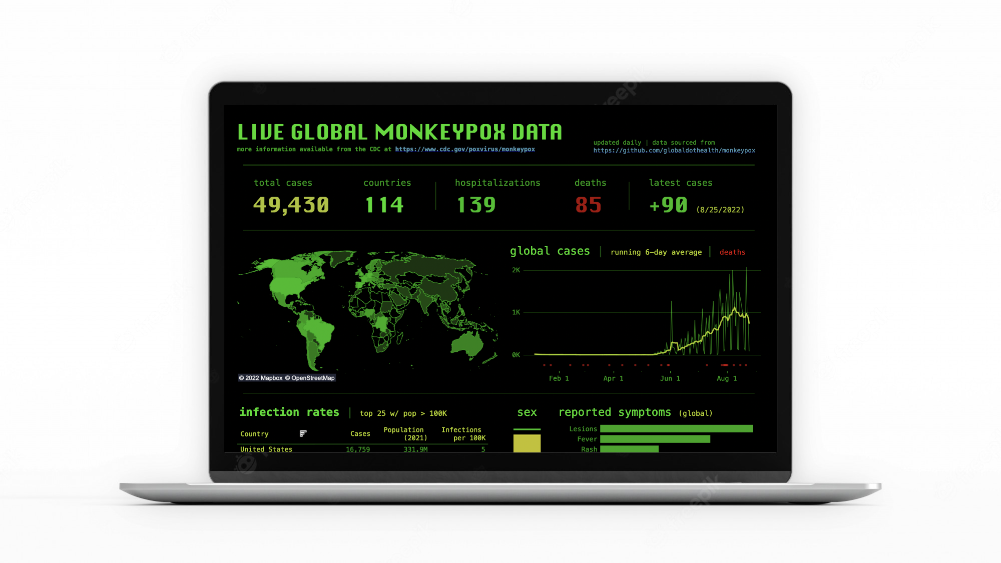
Automated Monkeypox Case Dashboard
Built a daily-updating public health dashboard during the 2022 monkeypox emergency to keep case counts fresh without manual effort. The pipeline ingests public health data, validates it, and pushes it straight to a Tableau-ready database so outbreaks can be monitored in near real time.


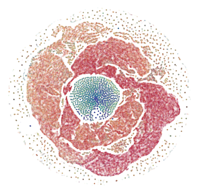
COVID Authorship Community Detection with Machine Learning
Early grad-school experiment: mapped COVID-19 co-authorship to see how different clustering methods reveal the research network. Built a large collaboration graph, compared Infomap clusters to GraphSAGE embeddings, and visualized the differences.
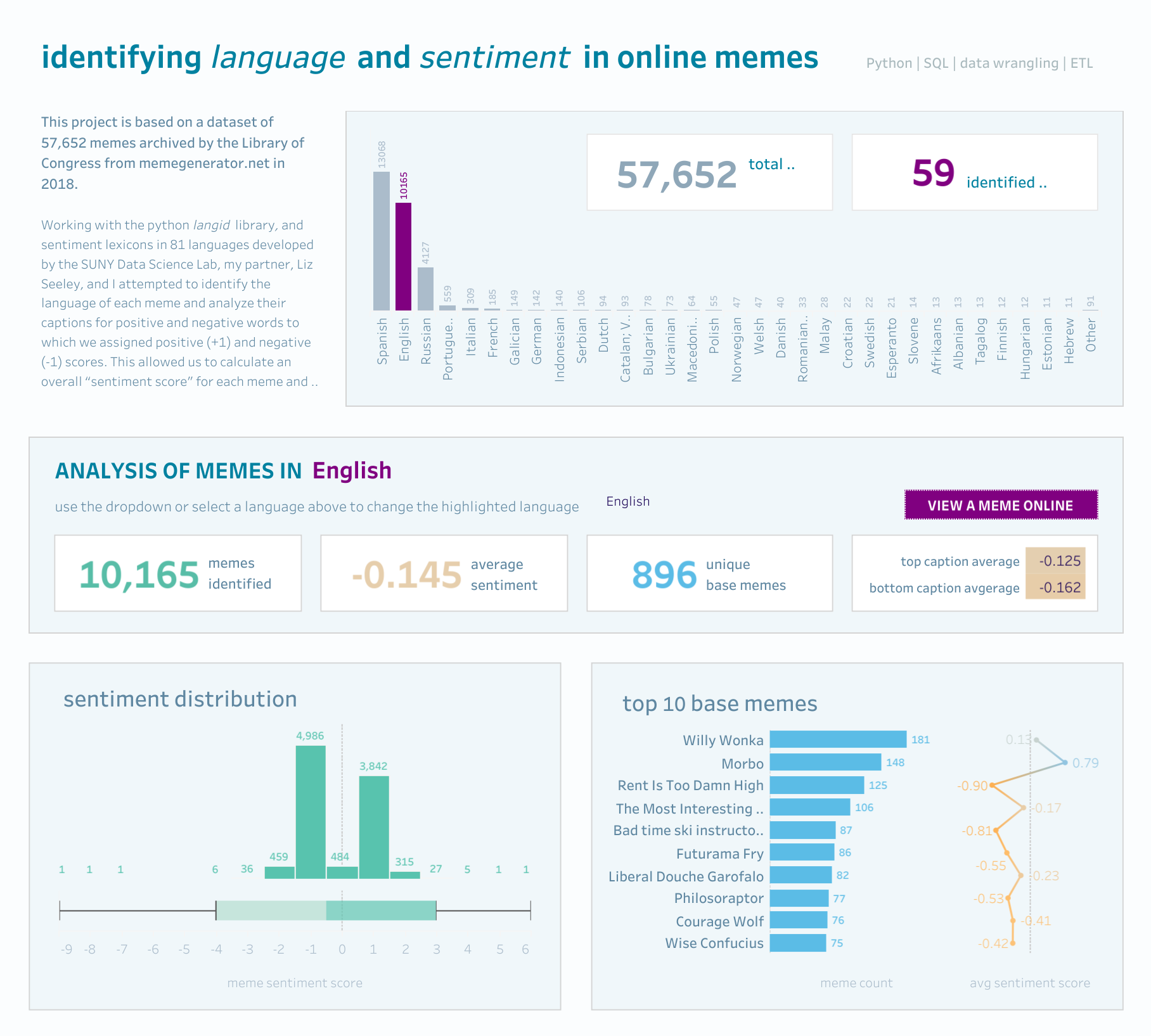
Meme Generator Natural Language Processing and Sentiment Analysis
Built a lightweight meme sentiment explorer with collaborator Liz Seeley to practice multilingual NLP and dashboarding. The project ingests 57,000+ meme instances across 82 languages, scores sentiment with lexicons, and lets you slice the results in Tableau without taking itself too seriously.
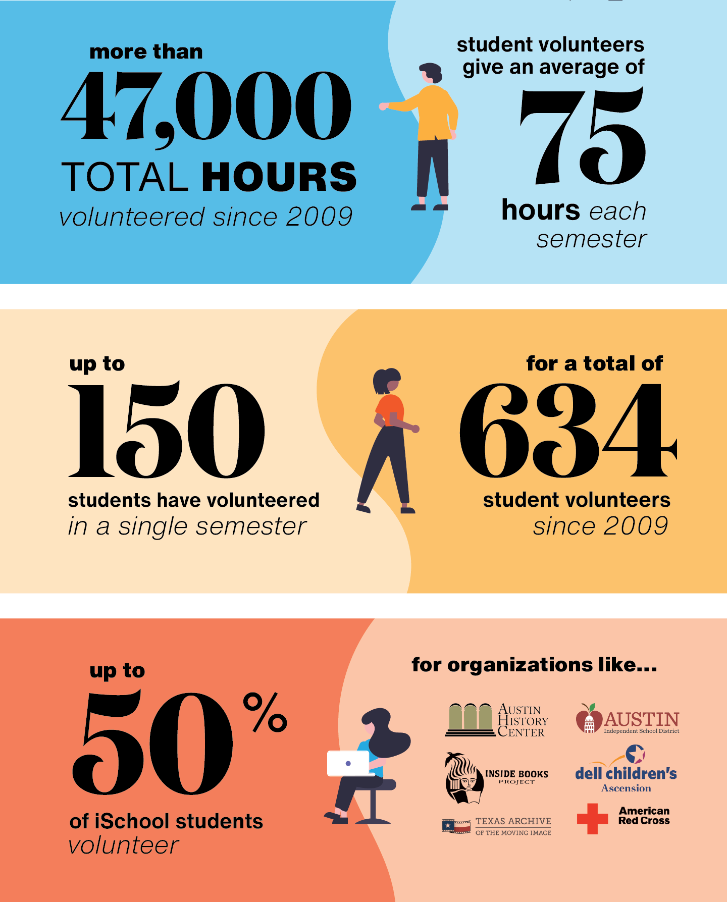
Early Work
Data visualization, graphic design, landscape design, and urban planning work