Alex 👾 does 🏗️ Data 🎛️

- Data Viz 13
- Tableau 8
- ETL 4
- Python 4
- Illustrator 3
- GIS 2
- Graphic Design 2
- Mapping 2
- SQL 2
- D3.js 1
- Machine Learning 1
- NLP 1
- Power BI 1
©2025 Alexander Reese
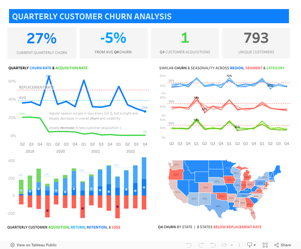
Quarterly Sales Churn Tableau Dashboard
Tableau exploration of acquisition, retention, and churn to spot at-risk segments before they slip away.
What question it answers
Which segments drive churn and where should retention spend go?
What I built
- Cohort-based Tableau dashboard tracking logo churn %, revenue churn, and replacement rate by segment, size, and state.
- State map and segment filters to quickly isolate hotspots and compare acquisition vs. churn within the same view.
Findings from the sample data
- Midwest SMB churn was trending up while replacement lagged new acquisition.
- Larger enterprise cohorts showed steadier retention but slower replacement when churn occurred.
Methods & cadence
- Cohorting, segment filtering, state-level mapping, and quarterly refresh cadence to mirror leadership reporting.