Alex 👾 does 🏗️ Data 🎛️
- Data Viz 13
- Tableau 8
- ETL 4
- Python 4
- Illustrator 3
- GIS 2
- Graphic Design 2
- Mapping 2
- SQL 2
- D3.js 1
- Machine Learning 1
- NLP 1
- Power BI 1
©2025 Alexander Reese
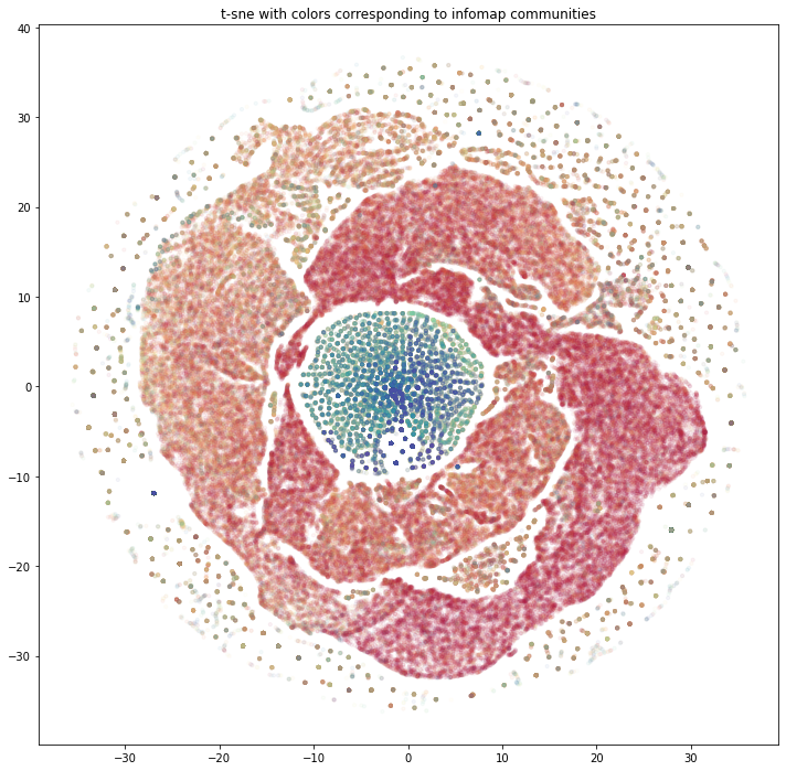
COVID Authorship Community Detection with Machine Learning
Early grad-school experiment: mapped COVID-19 co-authorship to see how different clustering methods reveal the research network. Built a large collaboration graph, compared Infomap clusters to GraphSAGE embeddings, and visualized the differences.
What I explored
- Parsed LitCovid data into a co-author network of ~300K authors and 2M+ edges using Pandas and NetworkX.
- Ran Infomap for community labels and GraphSAGE embeddings + t-SNE/DBSCAN to see where methods align or diverge.
- Visualized clusters to compare tight algorithmic communities versus looser embedding neighborhoods.
Takeaways
- The two methods surface different shapes of the network—useful reminder to test multiple approaches before interpreting clusters.
- Notebooks keep everything reproducible; see the GitHub repo.